Figma - Collaboration, iteration and presentation
Figma is the ultimate tool for taking digital projects to the next level. Whether you're a designer, product manager, developer or customer, anyone can work with Figma.
share article
.svg)


.svg)
.svg)
Published on
Author

Nadia Wiegand
UX + UI Designer
Figma is the ultimate tool for taking digital projects to the next level.
Whether you are a designer, product manager, developer or customer - anyone can work with Figma.
Figma is currently the most widely used tool among designers. The simplicity of use and the range of functions make it a very popular tool.
The advantages of Figma
✅ Figma is free in the "Starter Plan".
✅ Figma can be used in the browser
✅ Cloud-based: Extensive versioning
✅ Figma is available for Mac and Windows
✅ Real-time team collaboration
✅ Integrated hand-off tool
✅ Single Source Of Truth: Publish Team Libary
✅ High-quality prototyping
Figma has emerged as the gold standard of digital design in recent years.
In this article, we'll highlight the advantages of Figma and answer the question of why you should definitely work with Figma.
Anyone who implements digital projects today can no longer avoid Figma. And for good reason. With Figma we have the possibility to use projects from research to wireframing, design phase and technical implementation.
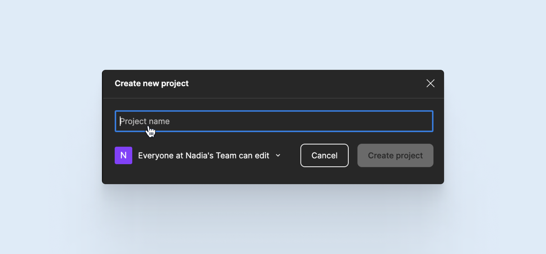
Structuring of projects and files
With Figma, we can create a project that includes multiple design files and FigJam files. For this project, members can then be added to edit files. (Professional Plan)
Create project
At the beginning of a project, you should consider how it will be built. Do you just want to put some designs in Figma or do you want to collaborate with the team?
Figma is designed to handle projects with multiple people. So when you create a project, you can immediately add other people and give them permissions.
Add members
Once you have created a project, you can add other people. They can then edit and view files.
Figma distinguishes in 4 access roles:
🧙♂️Admin:
This person has all permissions and can delete, add or edit files.
✍️ Editor:
This person can add, edit and view files. However, the person cannot delete files.
🤓 Viewer:
This person has access only to deposited versions of designs and can view them. The person cannot make any changes.
🧑💻 Prototypes only:
This person only has access to the prototypes and can test them. This person cannot see the file and cannot make any changes.
Assign authorizations
Figma also offers the possibility to assign permissions for individual files within the project. For example, you can share a file as admin so that anyone can make changes in the Figma file. Or you can give only certain people access to a file so that only those people can edit designs.
For agile prototype testing, there is now also the option of password-protecting the files.
This has the huge advantage that you don't have to define a user and mail address in the file before a test. The link and the corresponding password can be easily shared.
Structure design files
Within a design file we can structure ourselves using pages.
You can find the pages in the left panel.
Over the last few years, I have established a basic structure that you are welcome to adopt and expand and adapt for your needs:
🌫 Cover
ℹ️ How To Use This File
📖 Introduction
📯 Changelog
🤝 Developer Handoff
----- Design System ----
🎨 Colors
📐 Layout grid
📖 Typography
📏 Spacing
🧑🏻 Avatars
♣️ Icons
🏞 Illustrations
〽️ Logos
🔲 Shadows & Borders
----- Components ----
💠 Buttons
💠 Badges
💠 Input fields
💠 Dropdowns
..
----- Design ----
🕹️ Playground
🌈 Design
---- Archive ----
📦 V 1.0
The powerful toolbox from Figma
Faded are the dark shadows of the "I'll build the design in Photoshop" era. Anyone who deals with the topic of digital design today cannot get around the basic requirement of responsiveness. Here Figma offers a lot of features that support us in this.
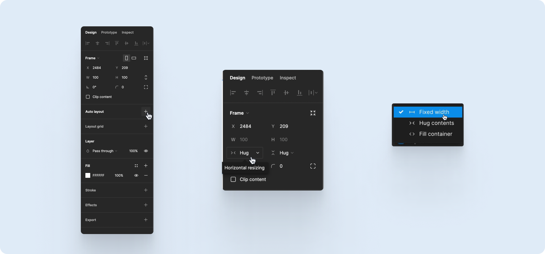
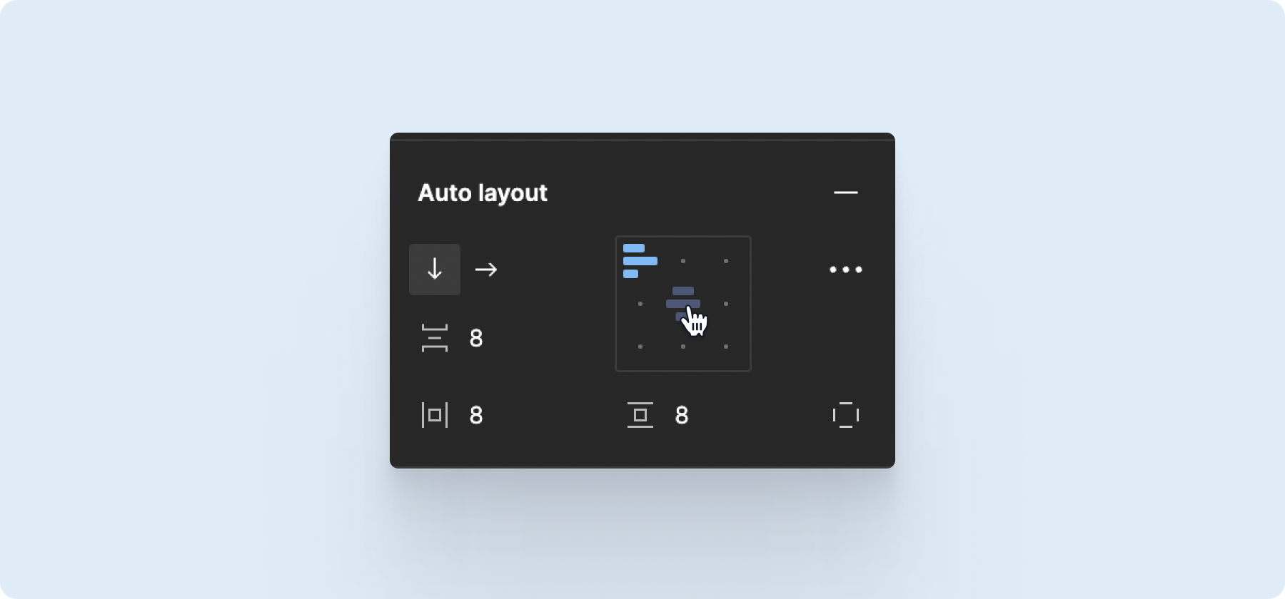
Auto Layout
Already in the design process, we can build interface elements in such a way that they can be implemented technically without any problems. We work, similar to the developers, with padding and margin.
Vertical & Horizontal Resizing
UI elements can be defined in their height and width:
📏 fixed width
🔛 hug contents
🎁 fill container
Direction
Analogous to the flexbox, we can define the direction of the child elements as horizontal or vertical. The distance between the elements can also be set.
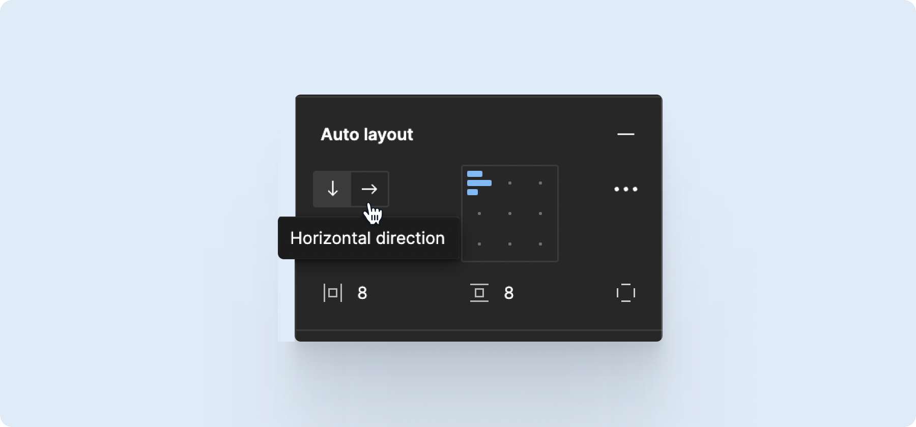
Alignment
In addition to direction, we can assign an alignment to an element as to how it arranges itself within its parent elenent.
Components
With Figma, we can create components and entire component libaries that can be shared within the team. This helps to build a unified design system and use it within different design projects.
All components can be created with auto-layout. Each component can be built with variants. This is a very powerful tool to build interactive prototypes later, which can already give a very good feeling for the final result.
Setting up component libraries is a worthwhile investment, because it makes the collaboration of different designers in various projects clearer and faster in the course. Together, such a design system can be used to create features, new web pages.
A component can be a button, an input field, or even a whole module. I will show you how to build components in another blog post soon.
Variants are the different states that a component can assume.
For example, a button can have the following variants of the hierarchy:
🎛 Primary
🎛 Secondary
🎛 Tertiary
🎛 Link

There are buttons with and without icons:
♣️ Icon Leading
♣️ Icon Trailing
♣️ Icon Leading + Trailing
♣️ Icon only
♣️ Without icon
In addition, we can define the States:
Default
Hover
Focused
Disabled
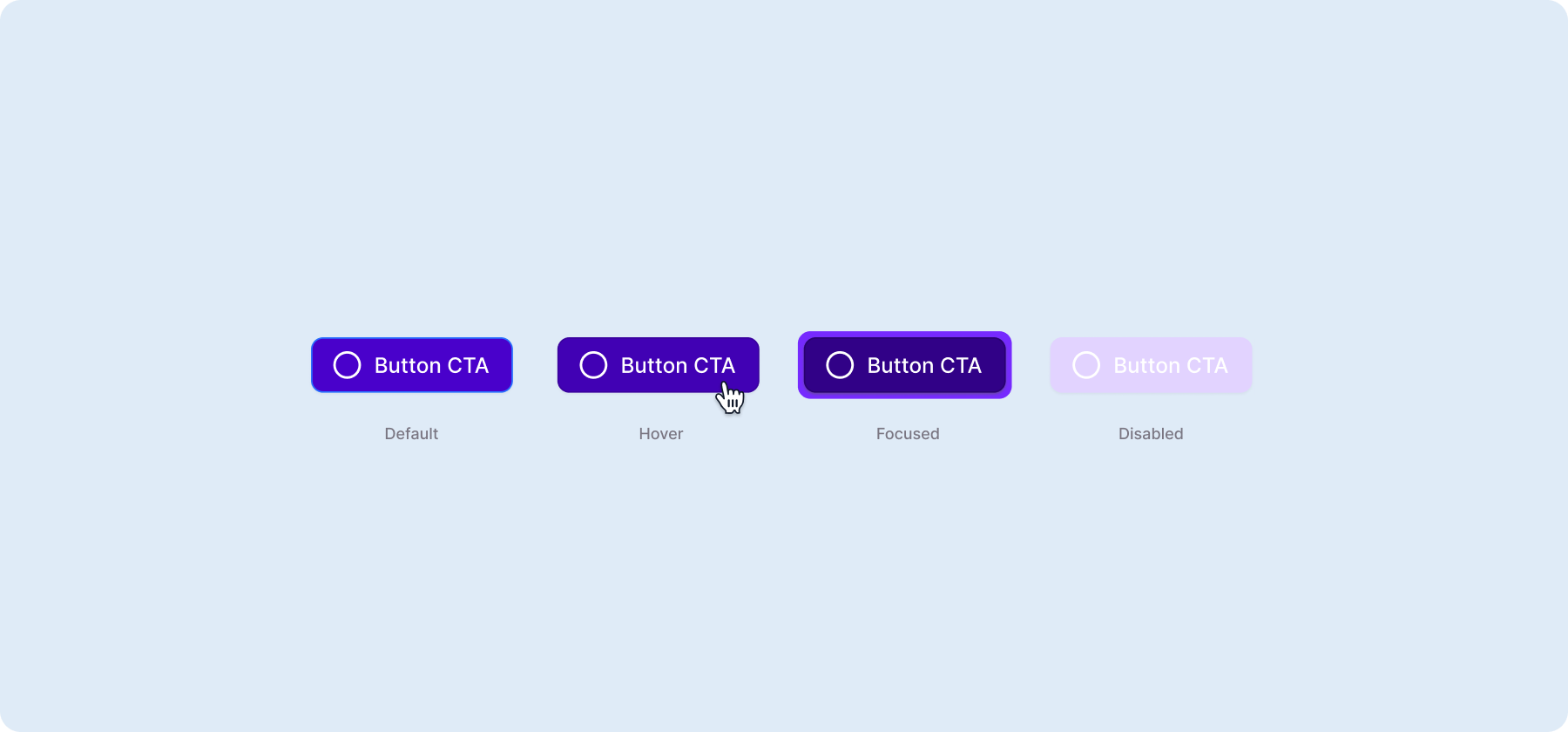
The differentiation of the possible variants is enormous. It is therefore worthwhile to acquire a structured setup.
With prototypes you can test ideas early
To get from the idea to the final product, we have to work iteratively. This includes, above all, testing content in a timely manner. With the prototyping tool in Figma, we can very quickly test designs and create interactive elements without having to slog through other software. You can easily generate a link to your prototype and share it with others. This way you can integrate feedback directly into your design.

Conclusion:
Figma offers all the functions we need to design a digital product. From research to technical implementation. If you haven't yet got to grips with Figma, you should urgently do so.
These works might interest you
New design system in Figma for Deichmann
.webp)
Are you ready to set new standards?
Then let's talk.
